Fashion retail visual merchandising is the way a store uses clothing, mannequins, fixtures, lighting, and signs to present a collection and help customers shop it. It connects the look of the brand with practical decisions: which outfit attracts attention, where the customer finds its pieces, and how the display stays presentable during trading.
For a store network, the challenge continues after the first display is styled. The same campaign has to work in a compact store, a larger flagship, and a location missing one of the featured products. A useful approach combines a clear creative idea with instructions that teams can execute and reviewers can assess.
This guide covers the presentation choices, a worked campaign brief, and the process for adapting, launching, and reviewing displays across fashion stores.
What visual merchandising means in a fashion store
The window introduces the collection. Mannequins show how pieces work together. Rails and tables let customers explore colors, sizes, and alternatives. Signs explain the offer, while lighting and space help people see and reach the merchandise.
That scope is wider than dressing a window. The University of the Arts London’s store layout and visual merchandising course covers product positioning, customer flow, linked selling, and floor planning alongside presentation. The design and the shopping route need to work together.
Consider a jacket styled with a knit, trousers, and a bag. The mannequin may communicate the outfit well, but the store still needs a clear route to the available pieces. If the bag is only a prop, or the trousers cannot be found, staff need a way to explain that difference.
VM therefore sits within broader retail operations: creative teams define the presentation, store teams maintain it, and operations teams help resolve the stock, equipment, and timing issues that affect execution.
Build a clear presentation before adding more product
Give the window one main story
Choose the message before selecting props. A lightweight layering collection, an occasionwear launch, and a denim promotion call for different outfits and supporting details. Write the idea in one sentence that a store team can use to judge whether a proposed change still fits.
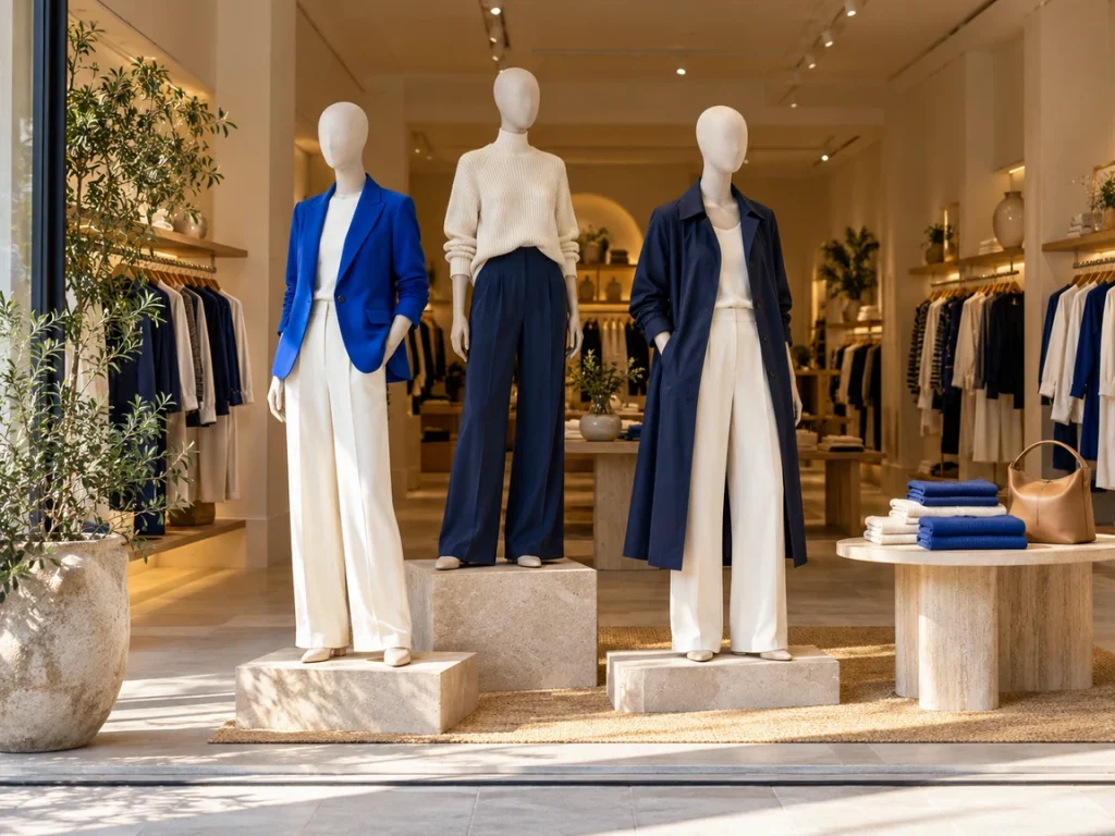
For example: “Show three ways to wear the new blue jacket through a working week.” That gives each mannequin a role. It also helps the team reject an unrelated accessory display that would compete for attention.
Use a clear focal point, then supporting elements. Contrast can come from garment color, height, texture, or lighting; every object does not need to be equally prominent. Check the view from the actual approach to the store, including an angled view if customers usually pass from one side.
Style complete outfits that customers can find
Use mannequins to show fit, layers, and combinations that are harder to communicate on a rail. Shopify’s guide to mannequins and body forms discusses their role in presenting merchandise in context. The useful question for your own display is what the outfit helps a customer understand.
A short jacket over a longer shirt, for example, demonstrates proportion. A knit with tailored trousers shows a different use from the same knit beside casual denim. Steam garments, position collars and sleeves deliberately, and make sure styling does not misrepresent the garment’s actual fit.
Keep a reference for the complete outfit, including accessories and footwear where relevant. Identify the featured products in the brief and show staff where customers can find them. If one piece sells out, use a pre-approved alternative or request a decision rather than improvising an unrelated look.
Use color and grouping to make the collection readable
Decide what the customer should recognize first: an outfit, a color story, a product category, or a use such as workwear. Then group merchandise accordingly. A feature table can build an outfit, while the nearby rail organizes the available sizes for easy browsing.
Repeat selected colors across the window and its supporting fixture so the connection is visible. Within a rail, make the sequence deliberate. Mixing categories, sizes, and colors without a clear rule makes it harder for a team to restore the arrangement after a busy hour.
The right product density depends on the brand, fixture, and shopping task. A premium display may use more space around individual pieces; a basics table may need enough visible size depth to be useful. Define the intended capacity for your fixtures rather than telling every store to display the same number of items everywhere.
Plan the route from inspiration to browsing
Stand at the entrance and identify what the customer sees first, what they can reach next, and where they can find related products. Place the supporting merchandise where the relationship makes sense. A display should not require staff to explain that its featured items are hidden in three unrelated zones.
Check that fixtures, promotional stands, and replenishment work do not interrupt the store’s designated routes. Apply the site’s safety and accessibility requirements when approving a layout; a VM photograph is not a substitute for those checks.
Include fitting rooms in the plan. Customers need clear directions, usable lighting, and an orderly space to assess the clothes. Decide where returned garments go and who restores them to the correct rail. A campaign can be well presented at opening and become difficult to shop if returns accumulate throughout the day.
Make lighting and signs support the merchandise
Use lighting to reveal the garment, its texture, and the focal display. Check the effect on actual products instead of approving an empty fixture. A dark knit that looked clear in a reference photo may disappear against a dark background in the store.
Keep the sign’s job specific: introduce the collection, identify a category, or explain a promotion. Avoid making a customer reconcile several competing messages on one fixture. Confirm that signs describe the products actually displayed and that expired promotions are removed during the changeover.
Give stores an approved sign location and a reference view. “Put the sign near the table” leaves room for it to cover merchandise, face the wrong approach, or be hidden behind a taller prop.
Turn the concept into a usable store brief
A mood board communicates the creative direction. A store brief explains how to build it. Include the reference image, required products, fixture placement, styling details, approved variations, deadlines, and evidence needed for review.
Keep required standards and permitted variations visibly separate. A smaller store may need a different fixture arrangement while retaining the same outfit, campaign message, and color story.
The following example is fictional and illustrates what a completed brief can contain. Its products, timings, and display choices are suggestions, not a customer deployment or a universal brand standard.
| Brief field | Example: blue-and-cream layering capsule |
|---|---|
| Customer idea | Three coordinated looks for a working week |
| Main product | Blue jacket, supported by cream knitwear and navy trousers |
| Window | Three complete looks in large stores; the lead look in compact stores |
| Supporting fixture | One table or rail beside the campaign area, with available featured products |
| Presentation reference | Approved front and angled photographs, outfit product list, fixture layout |
| Required elements | Lead jacket, agreed palette, current campaign sign, clear route to featured merchandise |
| Permitted variation | Compact stores use the approved single-mannequin layout; no extra plinth required |
| Stock exception | Use the named alternate knit if available; escalate a missing lead jacket to the VM owner |
| Ownership | Store manager assigns setup; VM reviewer approves presentation; replenishment owner resolves supply gaps |
| Timing and proof | Set a launch deadline for each store; submit the named views early enough for review and correction |
The brief should answer a predictable store question without forcing the team to search through a long chat history. Give it a version and an effective date. If the reference changes, identify which stores need to act again rather than leaving two valid-looking versions in circulation.
Adapt the display to store formats and stock
Consistency means customers can recognize the collection and navigate it; it does not require identical fixture counts in every location. Group stores by the physical constraints that matter to the campaign, such as window size, available mannequins, fixture type, and range carried.
Prepare the most common variations before launch. For the example above, the flagship can show three outfits, while a compact store leads with one mannequin and a supporting rail. Both show the same jacket and campaign palette. The smaller store should not be penalized for following its approved version.
Keep exceptions specific. Suppose a compact store has the jacket but has not received the cream knit. The store records the missing item, checks the approved substitute, and sends a photo of the revised outfit for review. If the jacket itself is unavailable, the VM owner decides whether to delay the display or use a different approved lead product.
This separates the work the store can do from a dependency someone else must resolve. A task marked “display incomplete” is less useful than “lead jacket missing; allocation owner to confirm replacement; store ready to install once received.”
When a local variation is approved, retain its reference with the store’s assignment. The next reviewer then assesses the agreed version instead of asking the store to revert to an unsuitable flagship layout.
Launch the display and maintain it through trading
Use a sequence that leaves time for corrections before customers see the campaign:
Confirm readiness: check that the store has the brief, featured products, fixtures, signs, and a named setup owner.
Build the display: follow the approved format and record any unresolved dependency immediately.
Submit the agreed views: show the full window, supporting fixture, and any detail the reviewer needs.
Review and correct: compare the submission with the applicable brief, give specific feedback, and confirm the revised result.
Maintain and retire: restore presentation during trading and remove or replace campaign elements at the agreed end date.
Treat the maintenance routine differently from a full reset. A quick check can cover disturbed outfits, depleted stacks, incorrect signs, and returned garments. A new collection or fixture move needs a broader review. Choose the frequency around trading conditions and campaign changes rather than assuming one schedule fits every store.
Use the visual merchandising audit checklist for the detailed assessment. It covers windows, entrance displays, floor layout, product presentation, fitting rooms, signs, and photo evidence, with an existing PDF and editable spreadsheet option.
Example: weekly VM review at Under Armour CEE
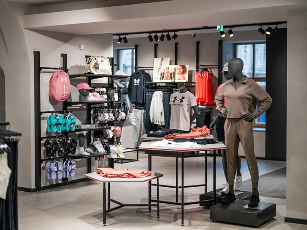
The Under Armour CEE case study describes a weekly process across 22 stores: teams submit photos by store section, reviewers assess them centrally, and items can be approved or reopened with feedback.
The case reports four hours saved each week per VM team member. That result belongs to the regional implementation and its review process; it does not establish a sales uplift or a saving that every retailer should expect.
The operational lesson is to define both sides of the handoff. A store needs to know what to submit, and the reviewer needs to return a clear decision that the store can act on.
Measure presentation quality and commercial results separately
Start with execution: was the agreed display ready, was it correct, and did it remain presentable? Then examine commercial results with the relevant context. These questions require different evidence.
| Question | Measure or record | What to watch for |
|---|---|---|
| Was the campaign ready on time? |
Stores approved by their launch deadline ÷ stores scheduled to launch |
Count missing submissions and unreviewed stores separately; submission alone is not approval |
| Was the brief clear enough? |
First submissions approved without correction ÷ first submissions reviewed |
Separate unclear instructions from stock constraints and execution mistakes |
| Are corrections being resolved? | Time from feedback to verified correction, plus the age of still-open findings | Reporting only closed findings can hide the oldest unresolved work |
| Did the featured products perform differently? | Relevant product sales, availability, and promotion context over the comparison period | Price changes, traffic, weather, and stock can affect the result alongside the display |
Agree on definitions before comparing stores. If one reviewer approves a local variation and another records it as a failure, the result measures inconsistent review as much as presentation quality.
For commercial evaluation, use your POS and other relevant systems. Compare similar trading periods or stores where possible, and record what changed with the display. A before-and-after increase is useful evidence to investigate, but it does not by itself prove that VM caused the change. The retail store analytics guide covers how to interpret store metrics in context.
Keep instructions, photos, and feedback connected
For fashion and beauty teams using Bitreport, store assignments can carry instructions, deadlines, and photo evidence. This gives the team a place to record the display work and gives managers visibility into what is complete or needs attention.
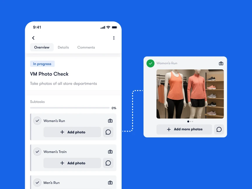
In the manual photo-review workflow, the VM reviewer can mark up an image and write feedback; the store sees the feedback in real time and repeats the correction-and-review process until it passes. The person reviewing the image makes the judgment. This is not an AI assessment of the display.
The software still needs a usable brief, named responsibilities, and a clear exception process. It can support execution of the creative decision; it does not remove the need to decide which look is right for a store or what should replace an unavailable product.
Start with one collection and its common store variations. Use the VM checklist to check the finished result. To see how assignments, photos, and review fit together, book a Bitreport demo with a campaign brief and an example of the feedback your stores receive today.